Lab 2: Connecting to and Cleaning Data
Lab 2 builds on our first lab by moving from simply opening a clean, well-structured file to tackling a more realistic challenge: importing and cleaning a poorly formatted journal entry data. We will work with a dataset of journal entries that contains extra header lines and page breaks that must be removed before analysis can begin. This lab will reinforce the initial data connection steps from Lab 1 and introduce basic data cleaning techniques.
1. Assignment
Submission: Two screenshots:
- One of the cleaned dataset (at least including all columns and the first 10 rows)
- One of a pivot table showing the number of journal entries recorded by each User ID
1.1. Learning Objectives
By the end of this lab, you will be able to:
- Import data from a text file.
- Identify and remove unnecessary rows (like headers and page breaks) from a dataset.
- Perform basic data transformations to prepare data for analysis.
- Perform initial exploration of data content.
1.2. Rubric and Grading
The intent of this submission is to produce a cleanly formatted dataset that could be handed off to a client or supervisor. It should look professional and require no further cleaning by the recipient.
- 5 points: No mistakes. The dataset is cleanly formatted (no extra whitespace, numbers are properly formatted, etc.), and column headers are correct.
- 4 points: Some mistakes (e.g., leftover whitespace like newlines or spaces at the beginning of the cell, unformatted numbers, correctable header issues).
- 3 points: Significant errors.
- 2 points: Incomplete submission.
2. Data
The dataset for this lab is JEA Detail Raw.txt (link), a tab-separated value file containing journal entry line items. This is a type of delimited text file, which is a common ways to store and exchange tabular data. Instead of a special format like an Excel .xlsx file, these are simple text files that can be opened by almost any application.
??? “More information on delimited files” In delimited files, columns are separated by a specific character, the delimiter. Common delimiters include:
* **Comma (`,`)**: These are called Comma-Separated Values, or CSV files. This is the most common type of delimited file.
* **Tab (`\t`)**: These are Tab-Separated Values, or TSV files, like the one we are using.
* **Pipe (`|`)**: These are Pipe-Separated Values.

Another related format is a **fixed-width file**, where each column is a specific number of characters wide, and data is padded with spaces to fit.

While delimited files are very portable, that portability can lead to issues. They are often generated by legacy systems or as simple data dumps, resulting in "dirty" data that requires cleaning. Common problems include:

* **Non-tabular features**: The file might contain extra information at the beginning or end, such as a report title, a description, a timestamp, or, in our case, repeating page headers and footers that are not part of the data itself.
* **Uneven rows**: Some rows might have fewer columns than others, often due to missing trailing delimiters for empty values at the end of a line.
* **Quoting and encoding issues**: Text data that contains the delimiter (e.g., a comma in a description field) must be handled carefully, usually by quoting the text. The file's character encoding (e.g., UTF-8 vs. ASCII) can also cause problems if not interpreted correctly.
* **Inconsistent data types**: A column might contain a mix of numbers and text, making it difficult for software to automatically detect the correct data type.
Our file, JEA Detail Raw.txt, represents a common scenario where a system output is not perfectly structured for direct use in analytics tools. It includes repeating header sections and other non-data lines that we will need to remove before any further understanding or analysis can be conducted.
For reference, here is the first few lines of the file:
Company XYZ                                                                                                PAGE 0001
REPORT DATE: 02/07/22  12:32
                                              GENERAL LEDGER DETAIL
                                              AS OF 12/31/21
====================================================================================================================
                   Account   Post               User                            Transaction
Account            Category  Date       Period  ID         Manual  Description  Number       Location  Amount
9504 Rent Expense  SG&A      9/11/2024  9       Laura4     Yes     Rent         1000         LA        " 50,000.00 "
9504 Rent Expense  SG&A      8/11/2024  8       Automated  No      Rent         1001         LA        " 50,000.00 "
3. How-to Steps
The following sections outline how to perform the lab in each modality.
3.1. Excel Steps
Excel’s Power Query (Get & Transform Data) is perfect for this kind of cleaning task: dropping junk rows, promoting headers, and trimming stray whitespace, all recorded as a repeatable set of steps. I strongly recommend you use it for this lab instead of cleaning the file by hand in Excel.
- Import the Data:
- Open Excel.
- Go to the
Datatab on the ribbon (you may have to open a blank worksheet if you don’t see the ribbon). - In the
Get & Transform Datagroup (far left), clickLaunch Power Query Editor....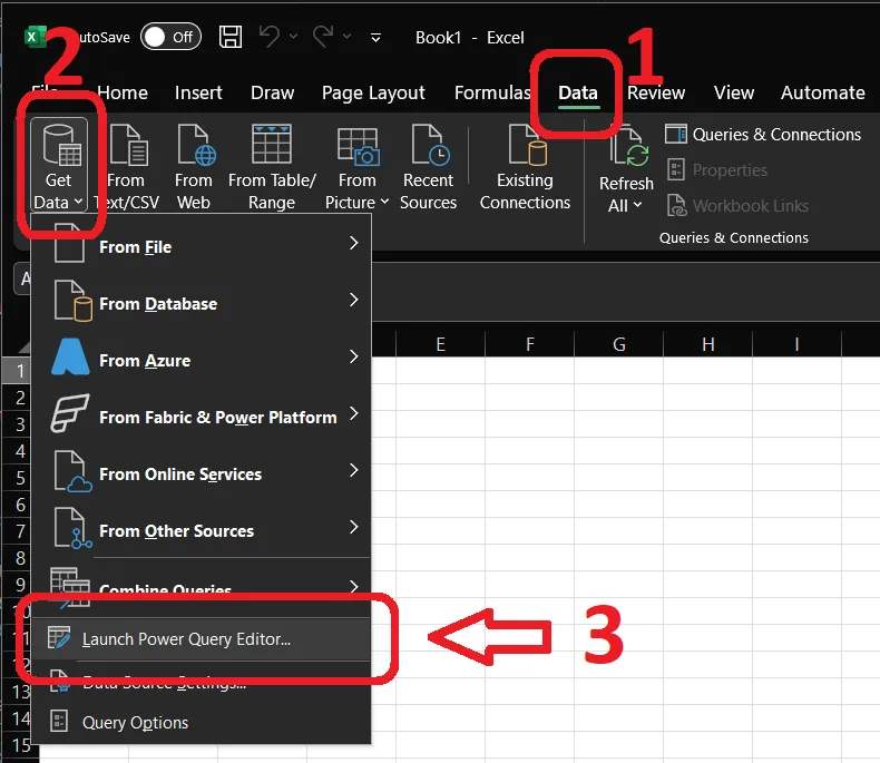
- In the
Hometab, selectNew Source>File>Text/CSV.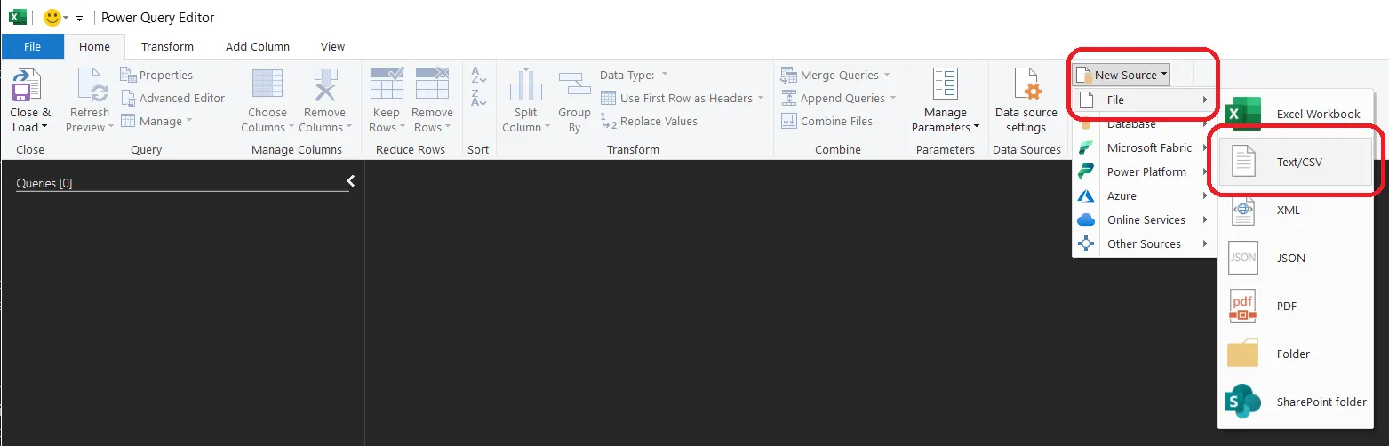
- Select the
JEA Detail Raw.txtfile and clickOKin the subsequent window (which will be showing you the first 100 rows of the file).
- Clean the Data in Power Query:
- Remove the report header rows: On the
Hometab, useRemove Rows>Remove Top Rowsto drop the report title, date, and separator lines above the real header row.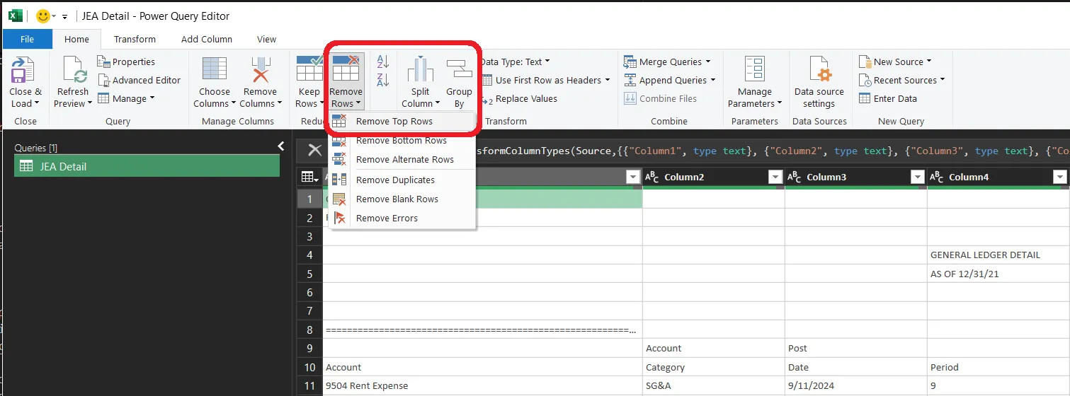
- Promote headers: On the
Transformtab, clickUse First Row as Headersso the header row becomes the column names.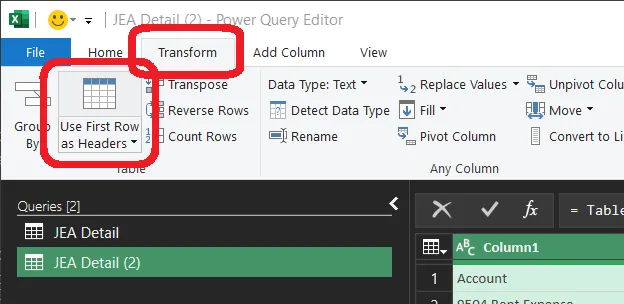
- Trim whitespace and filter junk rows: Select the text columns and use
Transform>Format>Trimto strip stray whitespace, then filter out any remaining blank or page-break rows (unchecknull/blank in a column’s filter dropdown). - Fix data types: Make sure the
Amountcolumn is set to a numeric type rather than text. - When you’re done, your list of
Applied Steps(right-hand panel) might look something like this: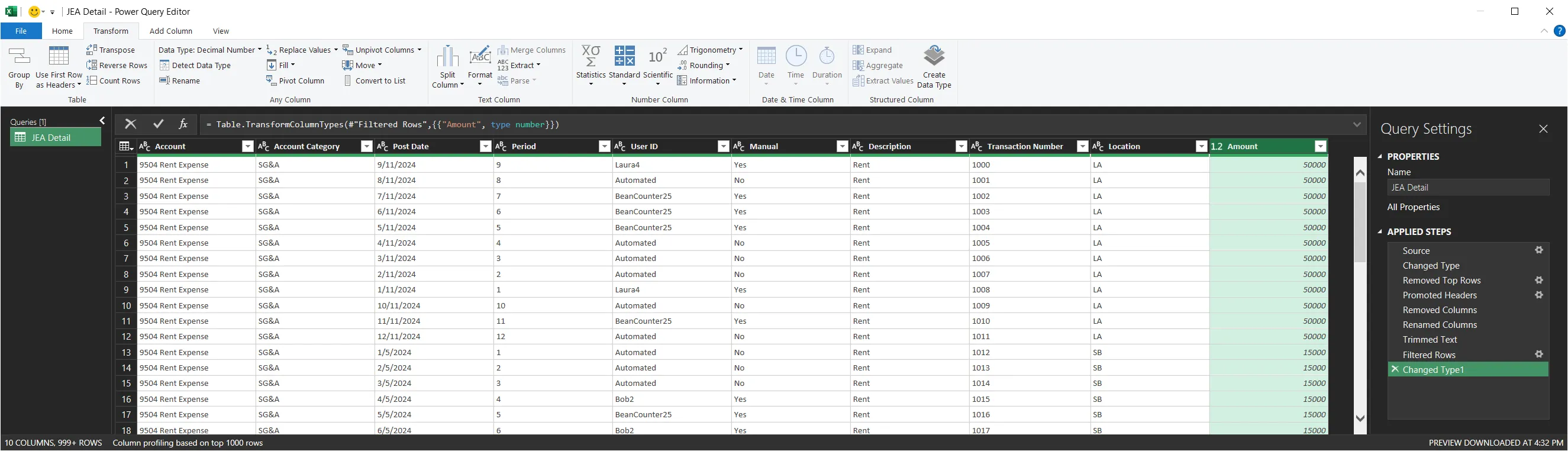
- Remove the report header rows: On the
- Load the Data:
- Click
Close & Loadin the top-left corner of the Power Query Editor (on theHometab). The cleaned data gets created as a table in a new sheet.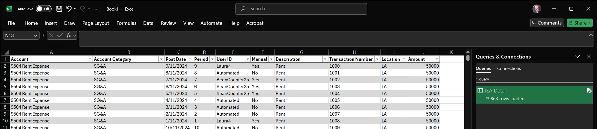
- Screenshot the first few rows of the cleaned data for submission.
- Click
- Initial Analysis:
- Count how many journal entries each
User IDhas.- Insert a Pivot Table from your cleaned data (
Insert>PivotTable). PutUser IDin Rows, and putUser ID(or any other column) in Values, set to summarize byCount. (See section at the end of this lab for a mini-tutorial.)
- Insert a Pivot Table from your cleaned data (
- Screenshot the resulting per-user entry counts for submission.
- Count how many journal entries each
3.2. Python Steps
Note to Python users: as with all programming, our lives are simultaneously easier and harder. Easier, because we are in control of every byte of data and can set up automation to be far more robust. Harder, because we must control of every byte of data and must set up automation to be far more robust. In this Lab, that means we need to be explicit about handling each data issue in the file that tools like Excel might manage for us. To get you started, I have prepared a notebook that you can open on Colab. Merely click the link below to open Colab, then either drag the JEA Detail Raw.txt file into the Colab file explorer so the code can access it, or add it to your Google Drive, mount said drive, copy the path, and paste it in to your code (as we did in Lab 1).

We will use the pandas library in a Jupyter Notebook to programmatically clean the data.
- Setup Notebook:
- Open my starter notebook in Google Colab (or a local Jupyter Notebook if you’re adventurous).
- If in Colab, upload the
JEA Detail Raw.txtfile to your session storage.
- Load and clean the data:
- We will import the data, but since it’s poorly formatted, we’ll need to handle the import carefully. The starter notebook I’ve provided walks you through that, as well as debugging you might do in a real scenario.
- Initial Analysis:
- With clean data, the power of pandas comes into play. Count how many journal entries each
User IDhas using a pivot table (this will come back up for Homework 2 :)
df.pivot_table( index='Row Variable', # What you want to group by and see in rows, e.g., User ID values='Variable to aggregate', # What value you actually want to be calculated in each cell, e.g., 'Transaction Number' aggfunc='how to aggregate', # How you want to process those values, e.g., 'mean' (default), 'sum', 'count', 'median', 'std', etc. margins=True, # Add a total column margins_name="Total", # Set the total column name ) - With clean data, the power of pandas comes into play. Count how many journal entries each
4. Submission
To complete this lab, provide screenshots that you have successfully cleaned the data and performed the initial analysis in whatever modality you wish:
- Capture a screenshot of the cleaned data table.
- Capture a screenshot of a pivot table showing the count of journal entries by
User ID.
Note: Consider the aesthetics of your screenshots. Clear, well-organized tables/results will help convey your findings more effectively.
5. Optional Pivot Tables Overview
A crucial skill in data analytics is the ability to summarize and cross-tabulate data using pivot tables. Pivot tables allow you to reorganize and aggregate data to reveal patterns that might not be obvious in the raw data format. You do not have to use Pivot Tables for this lab, but we are going to be exploring their functionality, and they would make Homework 2 easier, so I encourage you to try them out if you aren’t familiar.
5.1. Excel Pivot Tables
Excel provides powerful pivot table functionality through its Data tab:
-
Creating a Pivot Table: Tutorial
- Select your cleaned data table
- Go to
Insert>Pivot Table - Choose to place the pivot table in a new worksheet
- Drag fields from the Field List to the appropriate areas:
- Rows: Categories you want to group by (e.g.,
User ID) - Columns: Categories you want to spread across columns (e.g.,
Period) - Values: Numeric fields you want to aggregate (e.g.,
Sum of Amount)
- Rows: Categories you want to group by (e.g.,
-
Excel Advantages:
- Intuitive drag-and-drop interface
- Easy to filter and sort
- Built-in formatting options
- Can easily create charts from pivot table data
-
Best Practices:
- Ensure your source data is properly formatted as a table
- Use meaningful field names in your headers
- Consider using slicers for interactive filtering
5.2. Python Pivot Tables
Python pandas provides flexible pivot table functionality with the pivot_table() function:
-
Creating a Pivot Table: Documentation
# Basic pivot table df.pivot_table( index='Row Variable', # What you want to group by and see in rows, e.g., User ID columns='Column Variable', # What you want your different calculations to be in columns, e.g., 'Period' values='Variable to aggregate', # What value you actually want to be calculated in each cell, e.g., 'Transaction Number' aggfunc='how to aggregate', # How you want to process those values, e.g., 'mean' (default), 'sum', 'count', 'median', 'std', etc. margins=True, # Add a total column margins_name="Total", # Set the total column name ) -
Python Advantages:
- Complete programmatic control
- Easy to automate and reproduce
- Can handle complex multi-index pivots
- Integration with statistical analysis
- Custom formatting and export options
-
Best Practices:
- Use meaningful variable names
- Handle missing values appropriately with
fill_value - Format output for readability using styling options
5.3. Comparing Approaches
Each tool has its strengths for different use cases:
- Excel: Best for ad-hoc analysis and sharing with non-technical users
- Python: Best for automated analysis and complex data transformations
The key insight is that both approaches can produce similar analytical results, but the choice depends on your audience, the complexity of your analysis, and your need for automation.