Week 3

Describing and visualizing Data

Instructors
Maclean Gaulin

Descriptive Statistics Overview

  • Central tendency – where is the data located
  • Mean (μ), median, mode
  • Dispersion / variability – how spread out is the data
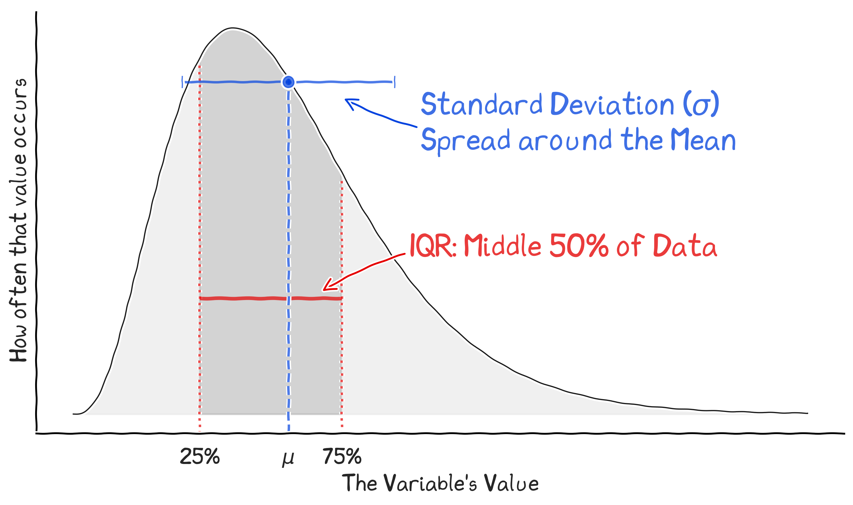
  • Variance, standard deviation (σ), inter-quartile range, coefficient of variation (σ/μ), mean absolute deviation
  • Shape – what are the “tails” of your data?
  • Skewness / kurtosis, percentiles, min/max
  • Frequency – categorical data

Key concept

descriptive statistics summarize the location, spread, and shape of data

Where: Central tendency
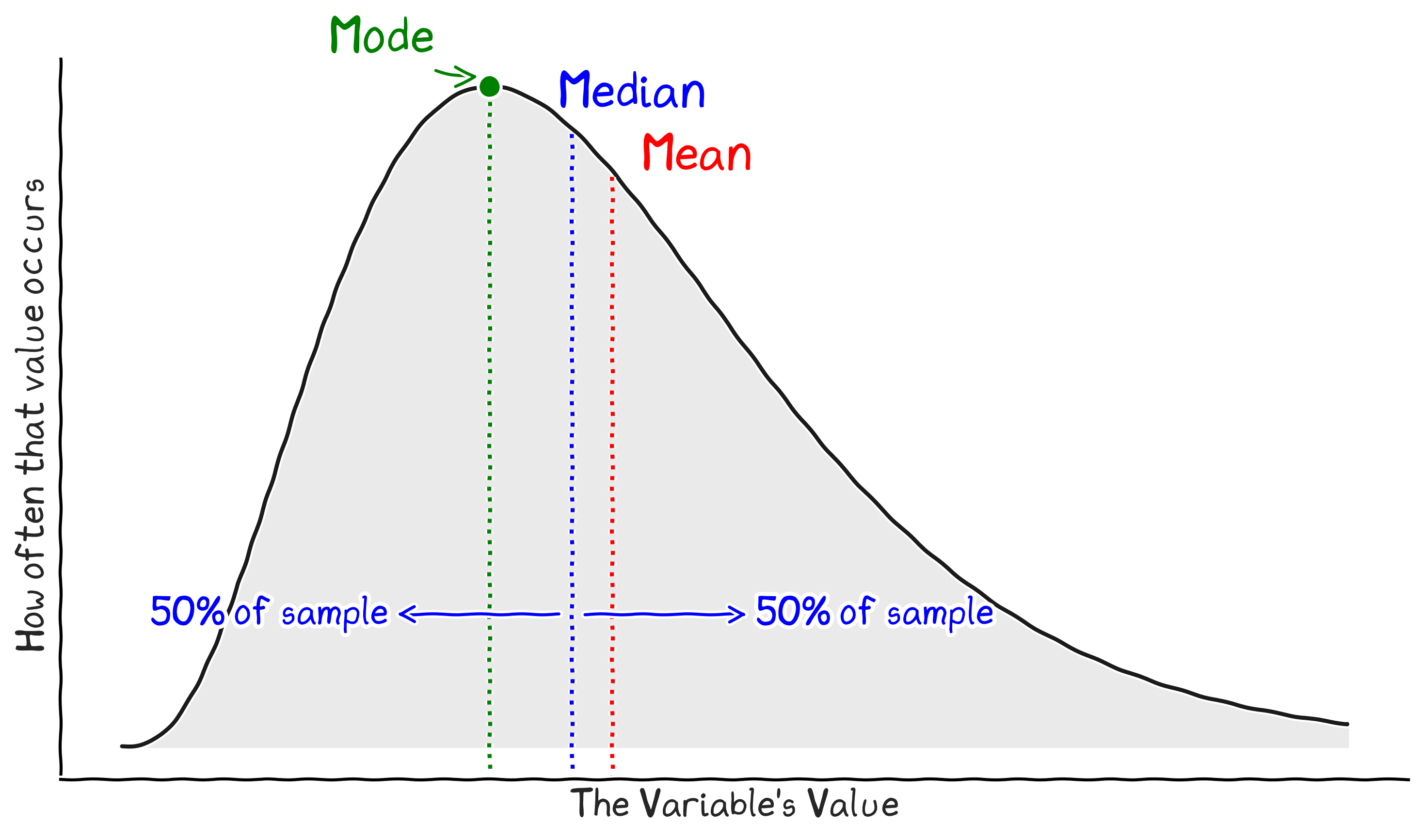
Where: Central tendency

Key concept

central tendency metrics locate the 'center' of a distribution

How Spread Out: variability

How Spread Out: variability

Key concept

dispersion measures how spread out data points are around the center

Shape: Skewness

Shape: Skewness

Key concept

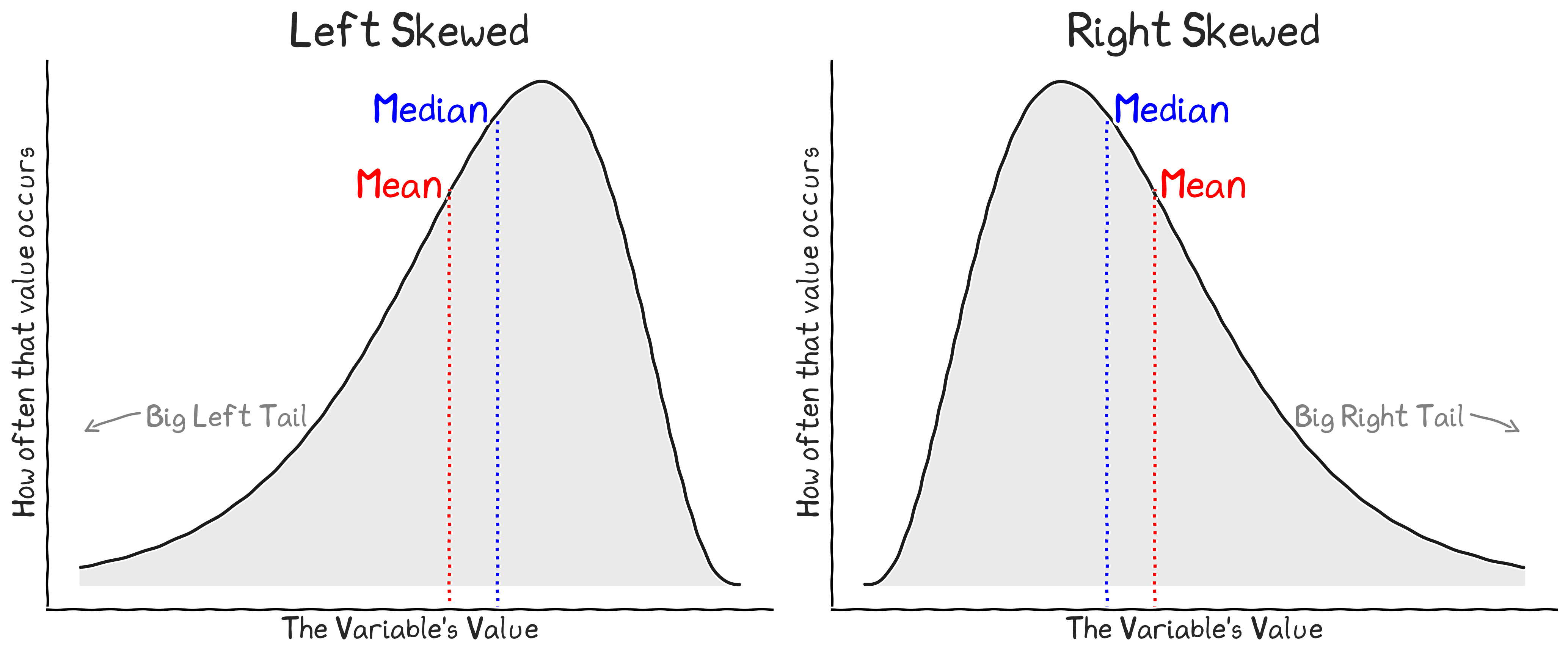
skewness indicates asymmetry in the distribution tails

Tails: Kurtosis

Tails: Kurtosis

Key concept

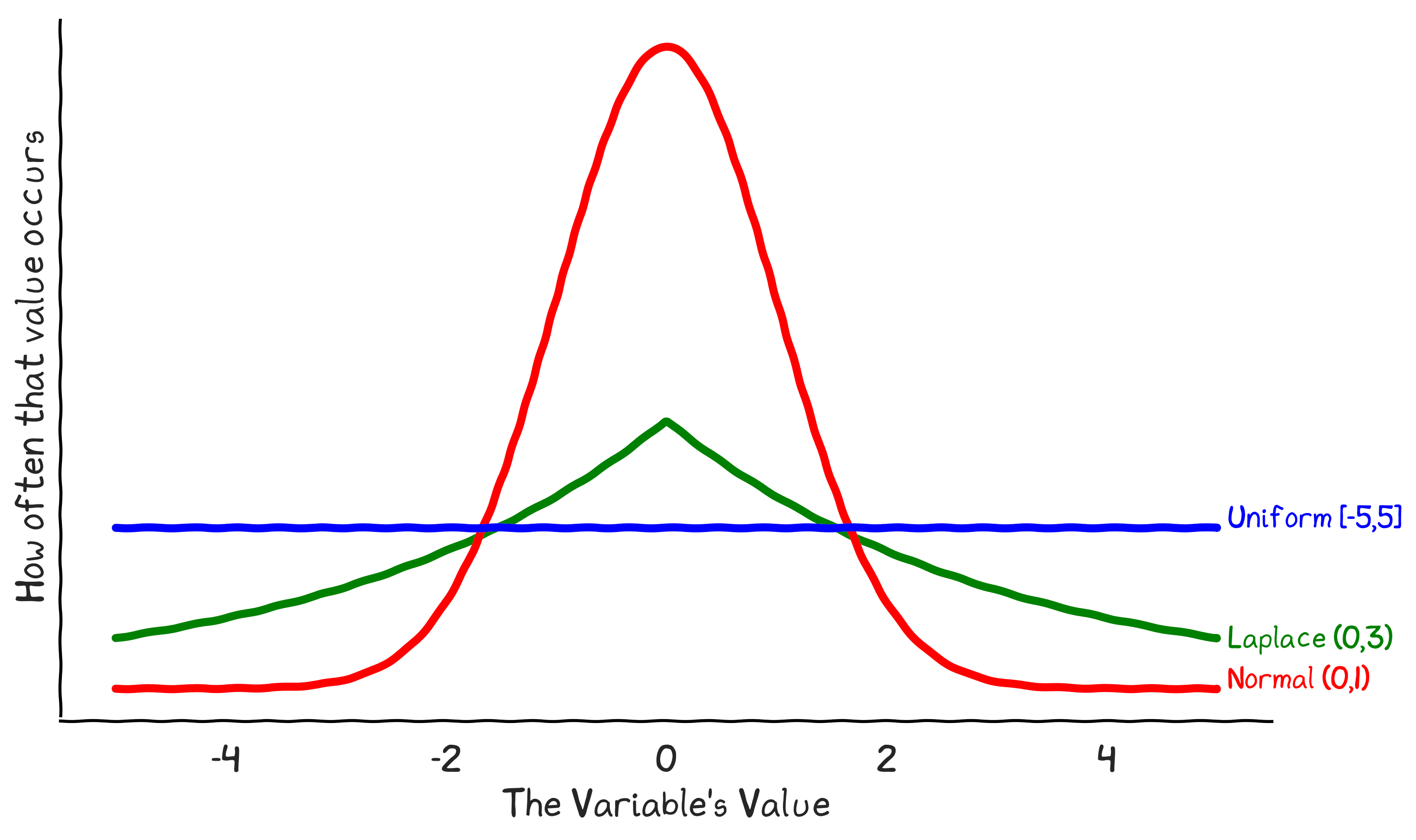
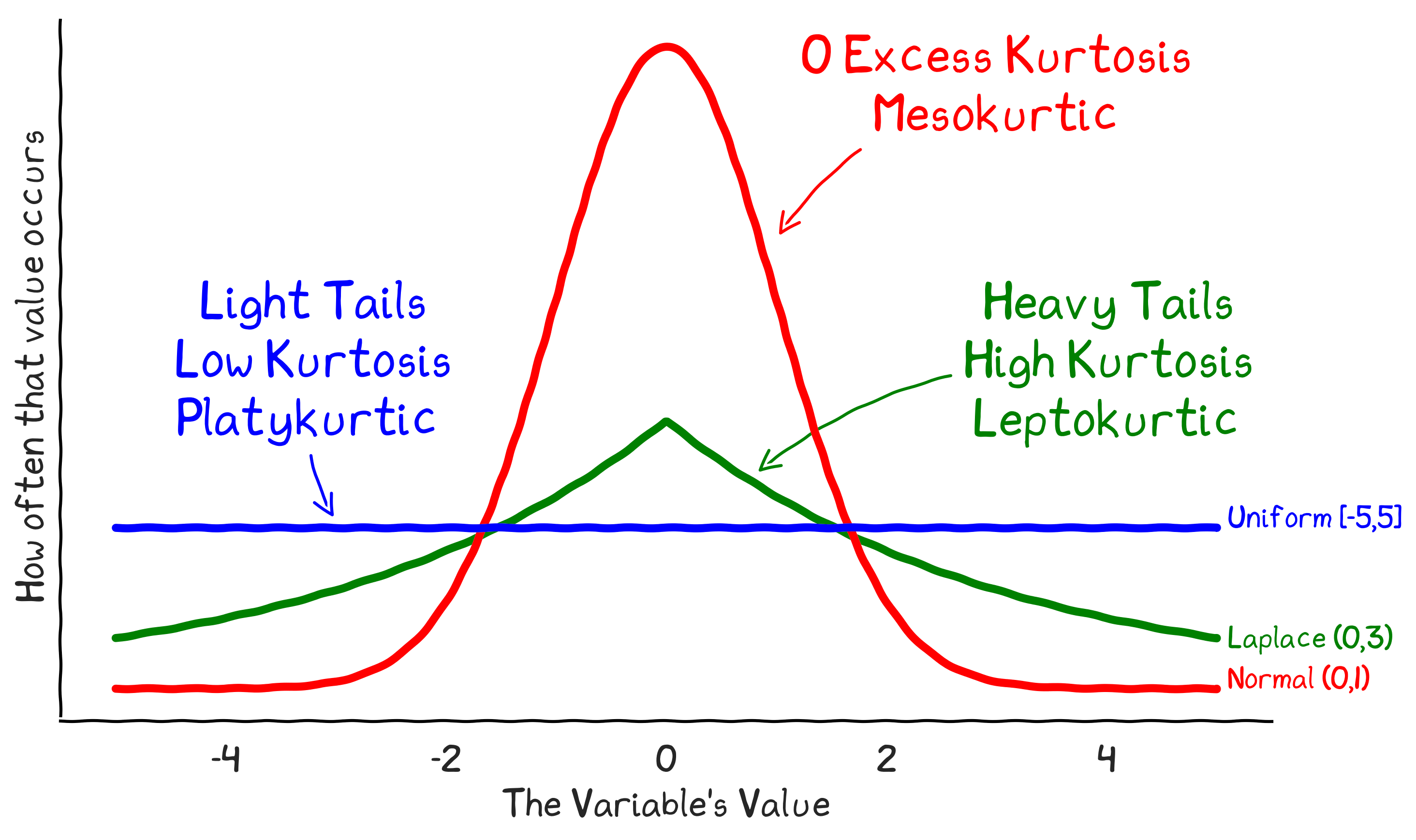
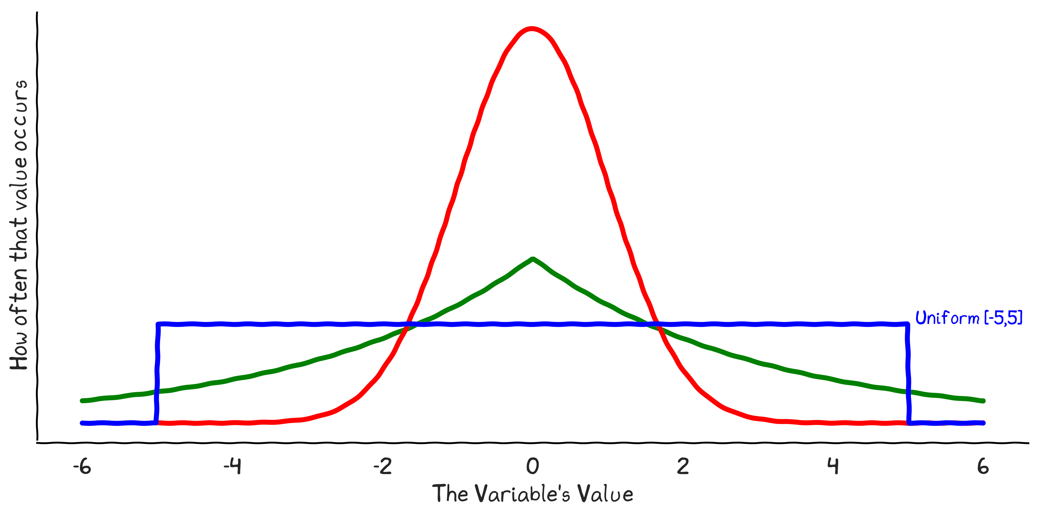
kurtosis measures the thickness of the distribution tails (outlier frequency)

Tails: Kurtosis

Tails: Kurtosis

Key concept

heavy-tailed distributions contain more frequent extreme events than normal distributions

Shape – Kurtosis

Shape – Kurtosis

Central tendency

  • Mean (μ)
  • Most common measure, basis of most statistics
  • Weighs observations differently, sensitive to outliers
  • Median
  • The “typical” value, with half above & half below
  • Immune to outliers
  • Mode
  • The “peak” of the distribution, most common value
  • Can have multiple modes, but may be less informative
When analyzing employee salaries in a firm with a few very highly compensated executives, which metric best represents the 'typical' employee salary?

Key concept

median is robust to outliers, while the mean is highly sensitive

Dispersion / variability

  • Standard deviation (σ)
  • Most common dispersion measure, basis of most statistics
  • Strongly affected by outliers (because math), normality
  • Inter-quartile range
  • Robust to outliers, good for skewed data, interpretable
  • Coefficient of variation
  • Dispersion as % of mean, comparable across units
  • Mean absolute deviation (or w/ medians)
  • Like σ, but less sensitive to outliers

Key concept

standard deviation is sensitive to outliers; IQR is robust

Shape

  • Skewness – asymmetric “tails”
  • Positive / right skewed: mean > median, more high values
  • Negative / left skewed: mean < median, more low values
  • Some models assume symmetrical data (skewness = 0)
  • Kurtosis – heavy or light “tails”
  • High  heavy tails, low  light tails
  • Percentiles – bins of data
  • Further resolution of full distribution, less of a summary
If a firm's distribution of invoice processing times is right-skewed (positive skew), what does this tell us about the mean and median?

Key concept

skewed data violates standard normality assumptions in many statistical models

Frequency Information

  • Count of values
  • Most common value
  • For ordinal data, 5-number summary
  • Min, 25%, 50%, 75%, Max
countmeanstdmin25%50%75%max
x14254.316.822.344.153.364.798.2
y14247.826.92.925.346.068.599.5

Key concept

categorical analysis focuses on frequency, mode, and ordinal percentile distributions

What doN’T descriptives convey?

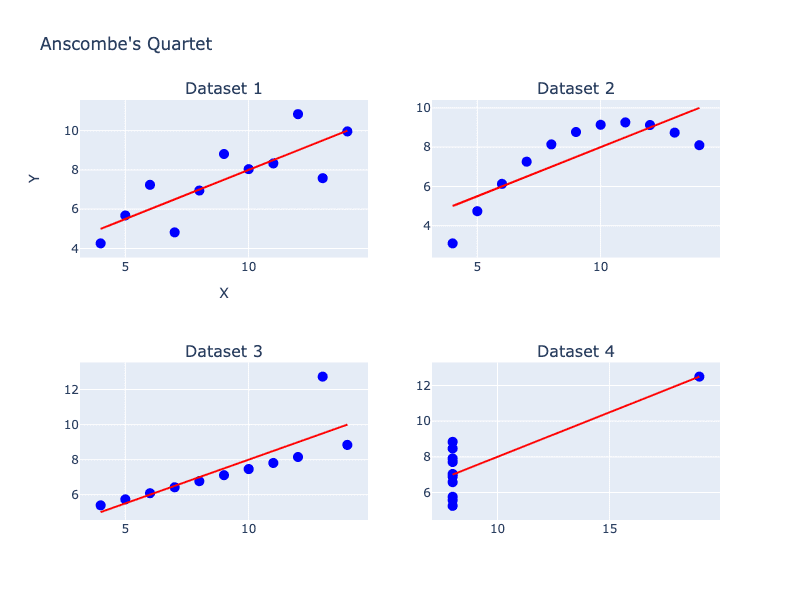
Anscombe's quartet
Dataset IDataset IIDataset IIIDataset IV
xyxyxyxy
10.08.0410.09.1410.07.468.06.58
8.06.958.08.148.06.778.05.76
13.07.5813.08.7413.012.748.07.71
9.08.819.08.779.07.118.08.84
11.08.3311.09.2611.07.818.08.47
14.09.9614.08.114.08.848.07.04
6.07.246.06.136.06.088.05.25
4.04.264.03.14.05.3919.012.5
12.010.8412.09.1312.08.158.05.56
7.04.827.07.267.06.428.07.91
5.05.685.04.745.05.738.06.89
Mean9.07.59.07.59.07.59.07.5
Variance10.03.7510.03.7510.03.7510.03.75
Correlation0.8160.8160.8160.816

Key concept

identical summary statistics can hide vastly different data shapes

What doN’T descriptives convey?

Anscombe's quartet
Dataset IDataset IIDataset IIIDataset IV
xyxyxyxy
10.08.0410.09.1410.07.468.06.58
8.06.958.08.148.06.778.05.76
13.07.5813.08.7413.012.748.07.71
9.08.819.08.779.07.118.08.84
11.08.3311.09.2611.07.818.08.47
14.09.9614.08.114.08.848.07.04
6.07.246.06.136.06.088.05.25
4.04.264.03.14.05.3919.012.5
12.010.8412.09.1312.08.158.05.56
7.04.827.07.267.06.428.07.91
5.05.685.04.745.05.738.06.89
Mean9.07.59.07.59.07.59.07.5
Variance10.03.7510.03.7510.03.7510.03.75
Correlation0.8160.8160.8160.816
The four Anscombe datasets plotted, showing four completely different shapes
What does Anscombe's Quartet demonstrate?

Key concept

visualization reveals hidden structure the summary statistics erased

Why Visualize?

Dataset
xy
55.497.2
51.596.0
46.294.5
42.891.4
40.888.3
38.784.9
35.679.9
33.177.6
29.074.5
26.271.4
55.497.2
……

Key concept

identical statistics can mask different patterns

Why Visualize

  • Human capacity for processing information is limited
  • Human brain adapted to visual pattern recognition
  • Improved understanding of complex data
  • Identification of patterns, trends, and outliers
  • Effective communication of analytical findings to various audiences
  • Inform decisions – insight, reasoning, understanding

Key concept

human brains are optimized for visual pattern recognition

Leverage Strengths, Mitigate Weaknesses

  • Leveraging strengths of human cognition
  • Visual bandwidth1: About 20 Mbps (1Gbps total)
  • Pre-attentive processing2: Instinctive processing
  • Graphical perception3: Process some designs better
  • Mitigate constraints of human cognition
  • Avoid overloading limited “working memory”4
  • Leverage external recognition

1

2

3

4

Which of the following is a pre-attentive visual attribute that the brain processes instantly?

Key concept

visuals shift the burden from working memory to perception

Visualization as Communication

  • Concisely conveying data
  • Telling stories for retention
  • Relevant XKCD
Visualization as Communication

Relevant XKCD

Key concept

visual communication must be tailored to the message and audience

Communicate by Storytelling

  • A story is a set of data, observations, or events that are presented in a way or order intended to evoke a reaction or specific conclusion
  • Can be as simple as well designed visualization
  • Can be fully narrative, without tables or figures

Key concept

a story connects data to an intended conclusion

Data Example

Data Example

Key concept

raw data without context fails to drive action

Storytelling Example

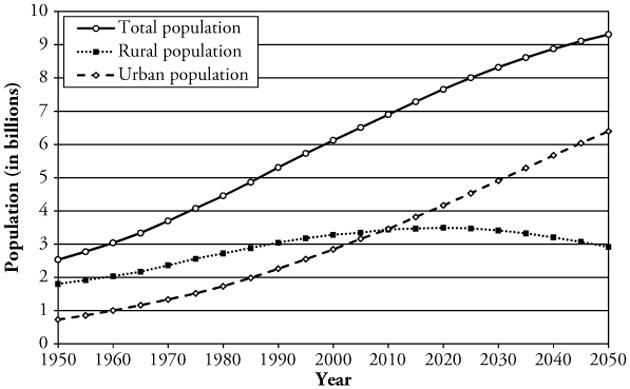
  • As the global population grows, much of that growth is happening in cities. In 1950, 70% of the global population lived in rural areas. In 2050 that is expected to decline to 30%

Key concept

narratives help audiences remember and internalize facts

Visual Narrative

The same urbanization data presented as a visual story rather than a table
  • Global populations are flocking to cities
  • In 2050, that is expected to fall to 30%

Key concept

visual storytelling combines narrative structure with data visualization

How to tell stories

  • Start with main idea
  • What conclusion do you want your audience to draw?
  • Consider audience and format, customize to match
  • Find a hook – something to grab attention and anchor memory
  • Storyboard – lay out the structure of your story
  • Slides, post-it notes, pen and paper. Flexibility is key.
What is the primary purpose of using narrative storytelling in a financial variance presentation?

Key concept

begin with the main takeaway and storyboard the path to get there

Lab 3 - Visualizations

  • Types of graphs
  • Learning through visualization
If you want to show the composition of a firm's expenses over time (e.g., how research, SG&A, and interest expense share of total has changed), which chart type is most appropriate?

Key concept

start with the question, not the chart type

Describing and visualizing Data